Profile of Recession and Recovery
In most recent years a famous graph, showing how deep the recession is in the UK and what is the path of recovery, appeared periodically. The graph is made by the National Institute of Economic and Social Research (NIESR) and compares the profile of the worst recessions in the UK over the past 100 years. The graph clearly shows that the last economic decline from 2008 is the longest of all compared episodes and that for more than 50 months the economy cannot return to its levels before the recession.
Profile of recession and recovery in UK
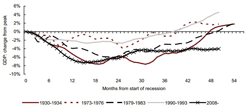
Source: NIESR, April 2012
The National Institute interprets the term “recession” to mean a period when output is falling or receding, while “depression” is a period when output is depressed below its previous peak. Thus, unless output turns down again, the recession is over, while the period of depression is likely to continue for some time. Data from last week showed that UK entered a new recession, which will additionally worsen this graph.
We decided to make this graph for Bulgaria as well, focusing on the last recession only. The downturn in Bulgaria took place in the first quarter of 2009. Recovery began modestly in 2010, strengthened in the first half of 2011, but then slowed considerably.
Despite the recovery over the past two years, the Bulgarian economy has not yet reached its levels prior the crisis, measured as real GDP at constant prices. If we use the above-mentioned definition of depression, the Bulgarian economy remains in a depression for 12 quarters or 36 months. Slowing growth in recent quarters and the dangers of entering in to a new recession are already visible in this graph. Reaching pre-crisis levels at the time remains wishful thinking.
Profile of recession and recovery in Bulgaria
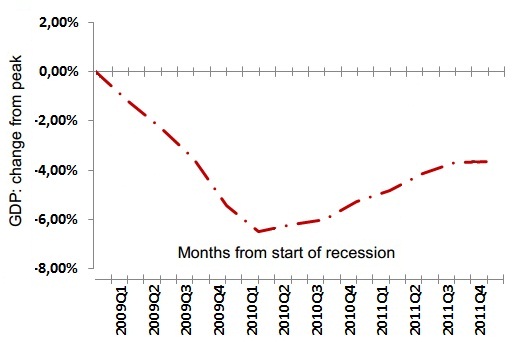
Source: NSI, IME (April 2012)